
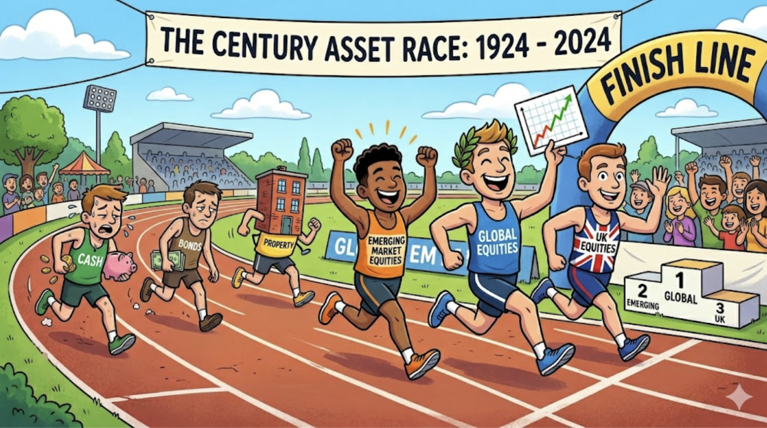
100 Years of Investment Returns: What the Data Says About Staying Invested
Investing can feel deeply unnerving at times.
A market drop of 10%, 20% or even 30% in a single year is enough to make anyone question whether they’re doing the right thing. Media headlines scream that Armageddon is here; portfolios fall; and the temptation to sell — to do something — can be overwhelming.
But what does the long-term data actually show? Is the pain of a bad year truly representative of what investors experience over time?
To answer that, we’ve drawn on data from Timeline Investments, covering calendar year returns for ten major asset classes from 1926 to 2025 — nearly a full century of market history. The data captures the best year, the worst year, the average annual return, and the percentage of years that were positive or negative.
The picture it paints is striking. Bad years have happened before, and they will happen again. But they are the exception, not the rule. And the investors who came out best were, overwhelmingly, the ones who stayed the course.
Note, the value of investments and any income from them can fall as well as rise and you may get back less than you invested. Past performance is not a reliable indicator of future performance.
The Data: 100 Years at a Glance
The table below summarises the best, average and worst calendar year returns for ten asset classes, along with the proportion of years that delivered positive returns.
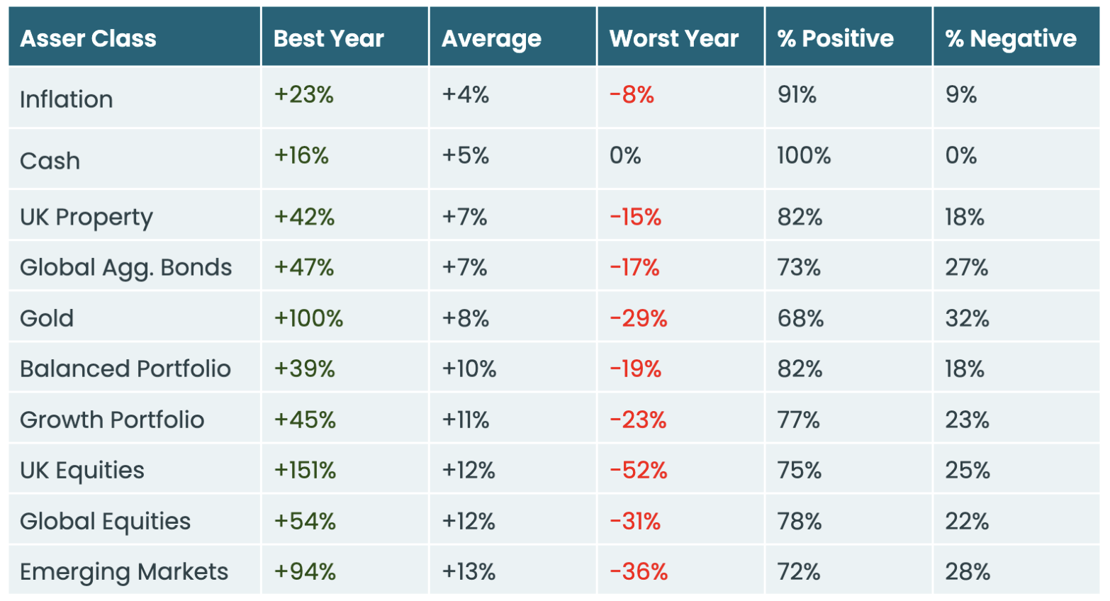
Source: Timeline. Calendar year returns, January 1926 to December 2025. Past performance is not a reliable indicator of future performance.
A Quick Guide to the Asset Classes
Inflation isn’t an investable asset, but it’s the benchmark everything else needs to beat. If your returns don’t exceed inflation over time, you’re getting poorer in real terms. The long-run UK average is around 4% per year.
Cash (measured by short-term Treasury Bills) is the ultimate risk-free asset. It has never delivered a negative calendar year return. But safety comes at a price: an average of 5% per year barely outpaces inflation, and in many recent years has fallen well behind it.
UK Property (measured by the Bank of England’s UK House Price Index) has averaged 7% per year, with the worst year being a 15% fall. Property benefits from being tangible and familiar, but it’s illiquid, expensive to transact, and heavily concentrated for most investors.
Global Aggregate Bonds (measured by the Morningstar Global Core Bond Index) represent a diversified basket of government and corporate debt from around the world. They’ve averaged 7% per year but, as 2022 reminded us sharply, they are not risk-free — the worst year saw a 17% decline.
Gold is the most polarising asset on the list. It has doubled in a single year (+100%) but also lost nearly a third (−29%) in its worst twelve-month period. It produces no income, no dividends, and no earnings. It’s a store of value and a hedge, not a growth engine. Positive in 68% of years.
Balanced Portfolio (typically 50% global equities, 50% global bonds) is where diversification starts to show its worth. The average return of 10% is strong, the worst year (−19%) is materially less painful than pure equities, and returns have been positive in 82% of years.
Growth Portfolio (roughly 70% global equities, 30% global bonds) steps up the equity allocation. Average returns rise to 11%, but the worst year deepens to −23%. Positive in 77% of years.
UK Equities (measured by the FTSE All-Share Index) show the widest range of any asset. A best year of +151% and a worst year of −52% — a spread of over 200 percentage points. But the average of 12% per year, sustained over a century, is a powerful reminder of the long-term reward for taking on equity risk.
Global Equities (measured by the Morningstar Global All Cap Target Market Exposure Index, a diversified basket of developed-world stocks) smooth out some of the UK’s volatility through geographic diversification. The average is the same — +12% — but the worst year (−31%) is considerably less extreme, and positive years are slightly more frequent at 78%.
Emerging Markets (stocks from developing economies) offer the highest average return at 13%, but with the widest swings after UK equities. The worst year saw a 36% decline. These are higher-risk, higher-reward markets that belong as a satellite allocation, not a core holding.
Three Things the Data Tells Us
1. Bad Years Are Normal — They’re Just Not Typical
Every asset class on this list (bar cash) has experienced at least one dreadful year. UK equities have halved. Gold has lost nearly a third. Even bonds — supposedly the ‘safe’ option — have dropped 17% in a single year.
But look at the frequency. Global equities have been positive in 78% of calendar years. A balanced portfolio: 82%. Even emerging markets, the most volatile equity category, have been positive in nearly three years out of four.
Bad years happen and are not a sign that something is broken. They are the price of admission for the significantly higher returns that patient investors earn over time.
2. The Average Rewards Risk
There is a clear pattern in the data: the higher the short-term volatility, the higher the long-term average return. Cash has never lost money in a single year, but averages just 5%. Global equities can lose 31% in a bad year, but average 12%. Emerging markets swing even wider, but average 13%.
This is the equity risk premium at work. Markets have to offer higher long-term returns to compensate investors for enduring occasional painful short-term drops. If equities were as safe as cash, nobody would accept the extra return — and it would quickly disappear.
The practical implication is simple: if you don’t need to access your money for ten, fifteen or twenty years-plus, the data overwhelmingly favours taking more risk, not less.
3. Diversification Genuinely Works
Compare the Growth Portfolio with UK Equities. The Growth Portfolio has a lower worst year (−23% vs −52%), a higher proportion of positive years (77% vs 75%), and an average return of 11% — only one percentage point behind UK Equities at 12%.
That’s the power of blending asset classes. You give up a small amount of upside in exchange for a significantly smoother ride. For most investors — particularly those drawing income in retirement — that trade-off is well worth making.
The Real Risk: Not Being Invested at All
Looking at this data, the biggest risk isn’t a bad year in equities. It’s not being invested in the first place.
Cash has never lost money. But it has averaged just 5% per year over a century — barely ahead of inflation at 4%. In real terms, cash has delivered approximately 1% per year of genuine purchasing power growth (and that’s assuming you’re achieving the highest interest rates available). Over a 30-year retirement, that’s the difference between maintaining your lifestyle and watching it slowly erode.
A balanced portfolio, by contrast, has averaged 10% — comfortably ahead of inflation, with the volatility smoothed by diversification. A growth portfolio has averaged 11%. Global equities: 12%.
The temptation to sit in cash and ‘wait for things to settle down’ is understandable. But history tells us that the cost of waiting is almost always higher than the cost of a bad year.
The Bottom Line
The last 100 years of market data tell a remarkably consistent story. Every asset class that offers meaningful long-term growth also experiences painful short-term falls. That’s not a flaw in the system — it’s the mechanism by which long-term returns are generated.
The investors who have done best are not the ones who timed the market perfectly. They’re the ones who stayed invested, rebalanced when needed, and trusted the process. The average return for a diversified growth portfolio over the past century has been 11% per year. That figure includes two world wars, the Great Depression, the dot-com crash, the global financial crisis, a pandemic, and every other crisis in between.
Bad years have happened. They will happen again. But for patient, diversified, long-term investors, the evidence is overwhelming: the odds are firmly in your favour.
Happy Thursday!
Kind regards,
George
Referrals Welcome
Our business grows mainly through personal recommendations. If you know someone—whether a friend, family member or colleague—who might benefit from financial planning, we’d be grateful if you could share my details with them. Alternatively, you can pass their details on to me, and I’ll be happy to reach out.
Regulatory Information
Blincoe Financial Planning Limited is an appointed representative of Sense Network Ltd, which is authorised and regulated by the Financial Conduct Authority. Registered in England & Wales (No. 14569306). Registered Office: Star Lodge, Montpellier Drive, Cheltenham, GL50 1TY.
Important Disclaimer
This blog is for general information only and is intended for retail clients. It does not constitute financial or tax advice, nor is it an offer to buy or sell any specific investment. Since I don’t know your personal financial situation, you should not rely on this content as tailored advice. While we aim to provide accurate and up-to-date information, we cannot guarantee that all details remain correct over time. We are not responsible for any losses resulting from actions taken based on this blog’s content.