
Twelve Charts of Christmas: A Review of Global Markets in 2025 and the Investment Outlook Ahead
2025: Another Good Year for Risk Assets
As 2025 draws to a close, we take a moment to reflect on a year that delivered another strong performance for investors. Through the following twelve charts of Christmas, we summarise key market developments, where we stand today, and what might lie ahead.
Please note that when investing, your capital is at risk. The value of your investment (and any income from them) can go down as well as up, and you may get back less than you invested, particularly where investing for a short timeframe. Neither simulated nor actual past performance is a reliable indicator of future performance. Investments should be considered over the longer term and should fit in with your overall attitude to risk and financial circumstances.
Charts 1-5: Looking Backwards
1. Another Strong Year for Equities – Globally
The world map below highlights how major regional indices have performed this year. As you can see, it's largely a ‘sea of green’, with gains across the board, a clear reflection of broad-based strength in global equity markets.

Japan led the way, with the Nikkei 225 surging +25%. The UK wasn’t far behind - the FTSE 100 climbed +20%, buoyed by strong showings from energy and financials. US equities also had another strong year, with the S&P 500 rising around +15% in dollar terms. However, for UK-based investors, currency movements muted these gains, with sterling returns notably lower (more on this shortly).
2. The Bull Market Enters Its 4th Year
The current bull market is now entering its 39th month, having begun after the 2022 inflation-driven wobble. Since 1970, bull markets have averaged 45 months and returned an average 124% — versus the current ~86% for the MSCI World Index (proxy for global equities).
While bull markets don’t “die of old age”, we are entering more mature territory.

3. Bonds: Solid, but Unspectacular
While equities surged ahead in 2025, bond markets delivered more muted - though notably more stable - returns.
To illustrate this, we’ve compared two portfolios from Timeline Investments (one of our preferred investment managers):
The Timeline Tracker 100 (green line below) – a 100% equity portfolio
The Timeline Tracker 0 (red) – a 100% bond portfolio, skewed towards shorter-dated government debt
Here’s how they’ve performed year-to-date:

The results highlight the classic risk/reward trade-off. Equities delivered significantly higher returns (+12% vs +4%), but with a much bumpier ride along the way.
4. Volatility is Part of the Journey
2025 wasn’t without its bumps in the road. From March to April, the S&P 500 fell 19% from peak to trough after President Trump announced sweeping global tariffs. Markets later recovered and pushed on to new highs in the second half of the year.
While unsettling at the time, this drawdown wasn’t far off the historical norm - the average intra-year decline for the S&P 500 is around -14%, as shown in the chart below.
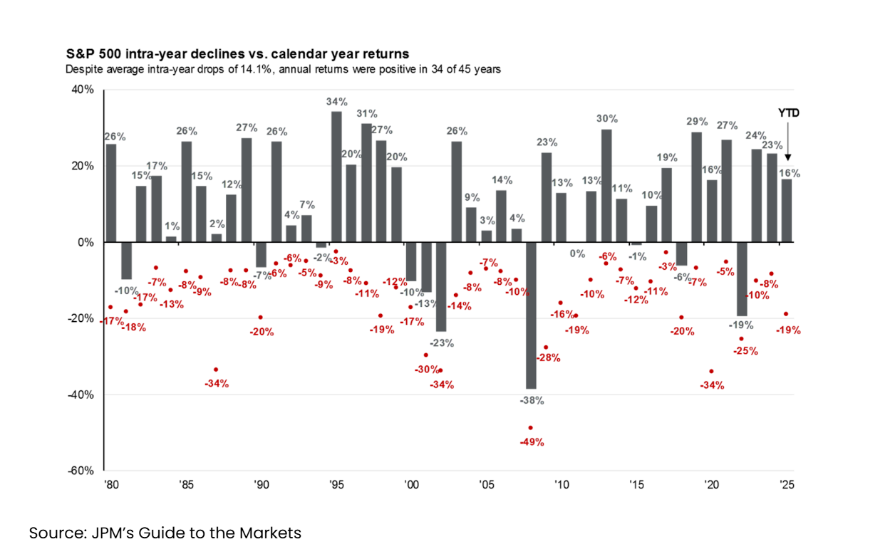
And it’s worth noting that over the 45 years shown above, the S&P has delivered average annualised returns of around 12%.
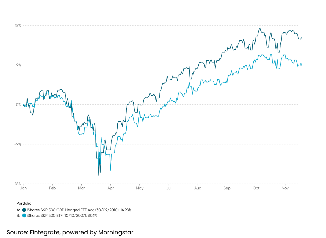
5. Dollar Weakness: A Headwind for UK Investors
For several years, a strong US dollar has acted as a tailwind for UK investors - not only benefiting from the stellar performance of US equities, but also from favourable currency conversion when translating returns back into sterling.
That trend reversed in 2025. President Trump’s latest round of tariffs and renewed concerns around the US fiscal position (rising debt pile) contributed to dollar weakness.
The chart below illustrates this impact. It compares the performance of the iShares S&P 500 ETF in both sterling-hedged and unhedged terms. As you can see, currency movements shaved around 6% off returns year-to-date - a meaningful drag for UK-based investors.
Charts 6-9: Looking Forward
Turning to where we stand today, and looking ahead…
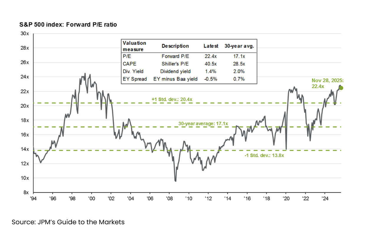
6. US Valuations Remain Elevated
A familiar theme persists: US equity valuations remain stretched. The forward Price-to-Earnings (P/E) ratio - a common measure of how expensive stocks are relative to their expected earnings - has climbed back toward its 2020 highs and is now approaching levels last seen during the dot-com bubble.
7. Valuations vs Short & Long-Term Returns
Elevated valuations don’t necessarily point to an imminent market correction. As the left-hand chart below shows, there’s little relationship between the starting P/E ratio and one-year returns.
However, over longer timeframes, the relationship becomes clearer. The right-hand chart shows a strong inverse correlation between starting valuations and subsequent ten-year returns — historically, the higher the starting valuation, the lower the returns over the decade that follows.
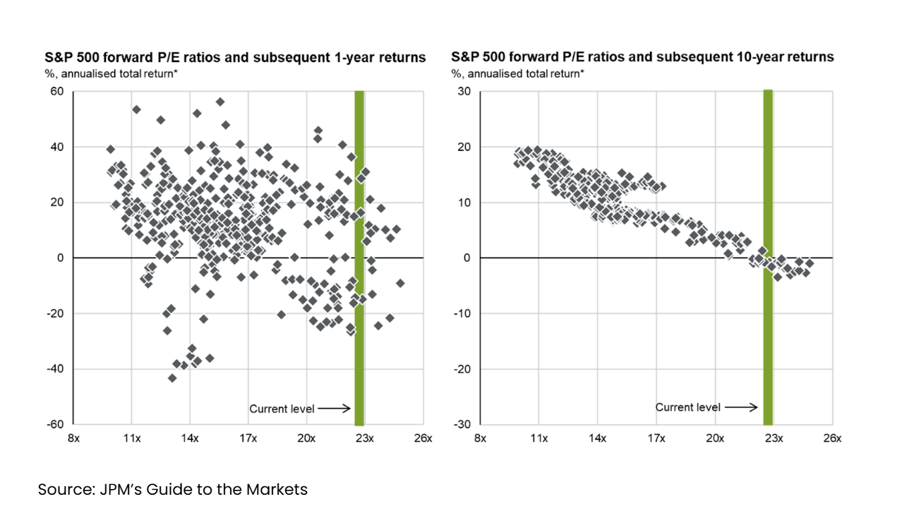
To be clear, this analysis focuses solely on US equities. Other regions - as we’ll explore shortly - appear more reasonably valued.
8. Yesterday’s Winners Are Rarely Tomorrow’s
Drilling into the recent strength of US equities - and the concerns around valuations - it's clear that much of the performance has been driven by a small group of dominant tech firms: the so-called “Magnificent Seven” Alphabet (Google), Amazon, Apple, Meta, Microsoft, Nvidia and Tesla. Some would now include Broadcom, expanding the list to a “Mag Eight”.
Together, these companies now make up around 35% of the S&P 500 - an unprecedented level of market concentration, largely fuelled by enthusiasm around Artificial Intelligence (AI).
Of course, this time could be different. The potential productivity gains from AI may well be unlike anything we’ve seen in our lifetimes, and the rewards could disproportionately flow to the US tech giants already leading the charge.
But history reminds us that yesterday’s winners rarely remain at the top. The chart below shows how the top 10 US companies by market cap have changed over time. Market leadership tends to rotate as consumer trends evolve and competition erodes previous dominance. And how today’s concentration compares with previous decades.
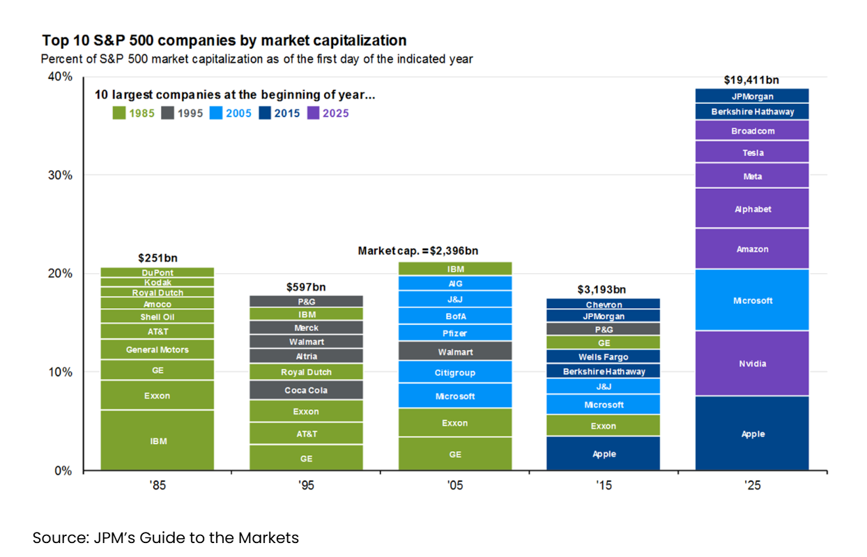
To be clear, we’re not bearish on the Mag7 - these are arguably among the best businesses in the world, and their earnings growth remains exceptional. But we do see growing risks with traditional passive global equity strategies that track market-cap indices, which now have roughly 20%-plus exposure to just seven firms.
This is particularly relevant given the rising interdependence between those businesses, and growing concern over the scale of AI-related capital expenditure both in absolute terms and as a share of company cash flow - going into data centre infrastructure.
This is why we’re comfortable with our current positioning. Within the equity component of the portfolios we typically recommend, exposure broadly tracks the global stock market, but with a deliberate tilt towards three key factors:
Quality – favouring companies with high and consistent profitability
Value – favouring those trading at more attractive relative valuations
Size – favouring smaller companies over the mega-cap names dominating headlines
In the context of the Magnificent Seven, this results in a structural underweight of around 50% (so halving the degree of concentration), a tilt we believe offers a more balanced mix of long-term growth potential and risk control.
9. Valuations Are More Attractive Elsewhere
On a more encouraging note, while US valuations remain elevated, other regions - including Europe, the UK, and Emerging Markets - appear more attractively priced.
As the charts below demonstrate, these markets are trading at a meaningful discount to the US and are generally tracking close to their long-term averages.

Charts 10-12: Core Investment Principles
While it’s fair to say that valuations - particularly in the US - look elevated, it’s equally important to return to our core investment principles.
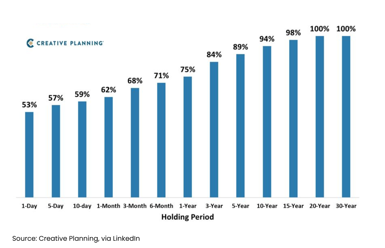
10. Time In the Market, Not Timing
As Warren Buffett once put it, “the stock market is a device for transferring money from the impatient to the patient.”
The chart below is a simple but powerful one. It shows the probability of achieving a positive return from the S&P 500, based on your investment holding period. Clearly, the longer you’re invested, the more likely you are to see meaningful growth. In fact, over every 20-year period since the index’s inception in 1928, the S&P 500 has delivered a positive return.
11. Diversification is Key
The previous chart focusses solely on US equities, which naturally make up the largest portion of most global portfolios. But diversification remains one of the most effective tools in an investor’s arsenal.
By spreading investments across asset classes, geographies and sectors, you naturally reduce your reliance on any single outcome and improve the overall probability of success.
The chart below illustrates this well. It shows how a balanced portfolio (white boxes) can smooth out the extremes of individual asset-class returns.

12. Climbing the Wall of Worry
Finally, amid the doom-mongering in the financial press, it’s worth remembering that volatility isn’t a bug of the system - it’s a feature of investing. Or, as we often refer to it, your admission ticket to superior long-term returns.
Every year, market commentators predict imminent sell-offs. And every year, markets face challenges, be it geopolitical shocks, economic uncertainty, or policy missteps. Yet time and again, equities have recovered and moved to new highs.
The chart below shows how markets have historically ‘climbed the wall of worry’. Over the past 150 years, through wars, recessions, pandemics, inflation spikes and crashes, markets have remained resilient.

When in doubt, zoom out. The long-term trajectory of the stock market reflects human progress, driven by innovation, rising productivity, and the compounding effect of reinvested profits.
It’s a clear reminder that successful investing is less about trying to time the market… and more about giving time in the market.
Twelve charts, one message: 2025 was another strong year, but long-term discipline, global diversification, and sticking to first principles remain the true drivers of investment success.
Merry Christmas from Blincoe!
And finally, from all of us at Blincoe, a very Merry Christmas and a heartfelt thank you for your continued support throughout the year.
We hope you enjoy a joyful, restful festive period with your loved ones, and we look forward to reconnecting in the New Year.
We’ll be taking a short break from the blog over the holidays, returning in the first week of January. The office will close this Friday and reopen on Monday 29th December.
Until then, happy Thursday, and Happy Christmas!
Kind regards,
George
George Taylor, CFA
Referrals Welcome
Our business grows mainly through personal recommendations. If you know someone—whether a friend, family member or colleague—who might benefit from financial planning, we’d be grateful if you could share my details with them. Alternatively, you can pass their details on to me, and I’ll be happy to reach out.
Regulatory Information
Blincoe Financial Planning Limited is an appointed representative of Sense Network Ltd, which is authorised and regulated by the Financial Conduct Authority. Registered in England & Wales (No. 14569306). Registered Office: Star Lodge, Montpellier Drive, Cheltenham, GL50 1TY.
Important Disclaimer
This blog is for general information only and is intended for retail clients. It does not constitute financial or tax advice, nor is it an offer to buy or sell any specific investment. Since I don’t know your personal financial situation, you should not rely on this content as tailored advice. While we aim to provide accurate and up-to-date information, we cannot guarantee that all details remain correct over time. We are not responsible for any losses resulting from actions taken based on this blog’s content.